Tuesday, 3 June 2014

Evaluation of Final Show

I had an amazing final show! I am so so happy with how it went, and also overwhelmed at my prize of Student of the Year, winning experience and a west end show.

Evaluation

On the day of the final show, I arrived forty-five minutes before my model to ensure everything had been set up and I had enough food to keep us going. I had given her a dressing gown, socks and nipple covers for her to get changed into prior to starting. I also had a hot water bottle to hand if she were to become cold.

I had an hour before the run through to make a good start, so I made sure the hair was up in a high ponytail. I used Gafquat to slick the hair down, but the use of water made her hair naturally frizzy at the ends. I knew this would be a problem later in the day but decided to start painting. I aimed to block out all of the yellow highlights before the run through, and maybe a bit more if I could. I managed to do all of the highlights and cover the top half of the body with paint, so I was happy with the head start.

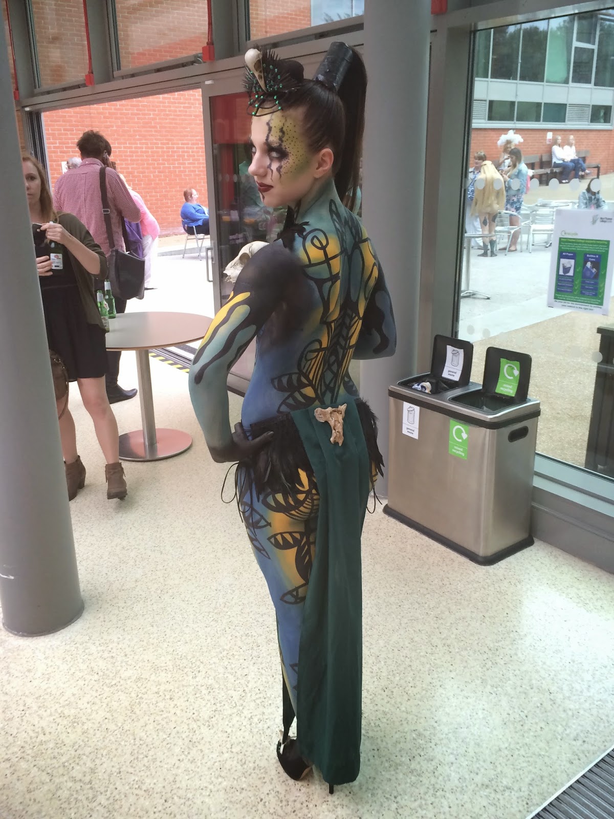
The run through ensured that the models knew exactly what they had to do, and also so they could get used to their shoes. The shoes were too big for the model, so by taping them to her feet with black electrical tape, it made her feel a lot more stable. This wouldn’t have been seen once the look was complete, as her feet are painted black anyway.

Once the run through was complete, I continued to block out the colours on to the body. This was a lot easier than the day of my photo shoot, as the barrier cream was preventing the colour to sit properly on the skin. This time however, I only used barrier cream on the elbows and the knees. This helped the paint to take to the skin and made the process so much easier. I decided to leave the armpits till last, as my model was very hot. Once the colours were blocked, I blended them together with a slightly damp kabuki brush. Again, this was much easier this time round, as the paint had been laid nice and thickly. I then contoured the body with a dark blue, blending as I went. This was a fairly quick process and didn’t encounter any problems. By contouring with this colour, I added depth and shape to my design.

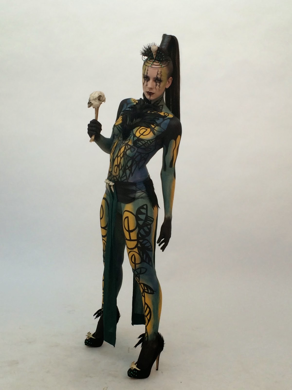
My next step was to start with the free hand patterns on the front, back and the legs. I took my time with this step, as I wanted to ensure that the lines were neat and symmetrical. I had started with the front, and I had my model leaning back in the chair to keep her body as flat as possible while I was working.  I found that the front went really well, and was a lot more symmetrical and tidy than my photo shoot, so I was very pleased. The problems I did encounter however, were when I was working on the legs. Every now and then, the paint was a bit too runny, and it started to run downwards. Instead of letting it ruin my design or having to wipe it off, I used it to my advantage. The patterns that I had created had allowed me to improvise if it went wrong, so the drips weren’t too much of a problem.

After painting the actual drips on to the top of the arms, I filled in the gap with a solid black. I notice in the photo shoot, that solid black on the shoulder stood out too much against the pattern and the blended background. I decided to blend the black into the pattern on the body, which made it look a lot better as it flowed.

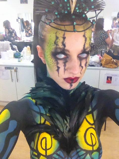
Next I began with the makeup. I asked my model to put in the contact lenses first, to avoid watery eyes. She was comfortable with this as she wears contacts on a daily basis. The makeup was very straight forward as I was confident in what I was doing. I was a little bit flustered as I felt I was running out of time, which made me do things in a different order than I would have liked. After looking back at my photo shoot, I decided to change the colour of the contour on the cheekbones from a natural grey colour, to a dark green blue. I felt by doing this I added depth the green on the face, and it would stand out more on the catwalk.

Next I had to attach the false ponytail and secure it with the toilet roll. I managed to make it stand up nicely with a bit of help from my tutor, as I need more than two hands! Afterwards I had to straighten the natural hair to try and tame it, but after doing so I also tried serum and hairspray to achieve a slightly better appearance. I still wasn’t satisfied, so I created to small ponytails within the ponytail, and laid hair over it, and secured it with small pins. This helped to flatten it down.

All of the makeup had been completed by this point, so it was just the finishing touches that had to be done. This included gluing on the feather front piece, which I did using latex. This went very smoothly, as I had learnt from the photo shoot to leave it to get tacky before applying. I then secured the loin cloth on with leather cord at each side, with the help from my tutor, and also painted the armpits and the hands. Then it was just the head dress, which was attached in a matter of seconds as it only need two pins to secure it, and the shoes. I had cut down some insoles for the shoes to make them slightly smaller, and then taped her feet into the shoes again. The insoles made her feel even more comfortable and stable, so I was happy with letting her walk down the stairs by herself.


Overall I am so pleased with how the day went, as everything went smoothly apart from a few things that needed to be rectified. The show went really well and felt I was able to show off my model. I ensured that she was comfortable throughout, and we both had a really good time. The paint on my models hands and armpits did come off slightly because of the heat, but other than that everything else was fine. I have learnt so much over the past year, and am very sad to be leaving West Thames and the amazing tutors.

Word count: 1110

 My beautiful model Natalie


Wednesday, 28 May 2014

Final Preparations

So the show is in five days time, and I have been busy updating my CV! I have also been creating a way to present them, alongside my portfolio, my profile, business cards and selected images.

I wanted to present my CVs in a way that ties in with the theme of my body paint, so it is easily identifiable. This will also make it look more interesting and memorable.

I decided to roll up my CVs and wrap a decoration around them. As I a using toilet roll in my models hair, wrapped with black tape, I thought this would be good to hold the CVs.

I had a lot of faux leather material left over, so I used this instead to glue to my toilet rolls!


I measured out ten pieces of leatherette, and used a glue gun to glue it to the toilet roll. The only problem was, that I was left with a visible seam on one side. 

To solve this problem, and to also tie it in with my theme even more, I attached a piece of green cloth.


I just folded over the edges, and glued the ends to the inside of the toilet roll. This had hidden the seam, and given it some colour. These are the same materials I had used to make the loin cloth.


To finish off the CV holders, I added a small bone to each one. This matches my loin cloth exactly in terms of style, and should make my CVs instantly identifiable with my design. I have created a little sign saying "Please feel free to take a CV", to make it clear what is inside each scroll. 

Alongside my portfolio and business cards, I have also created a free-standing sign for my online portfolio:


By scanning this code with a smartphone (using an app such as QRReader) it will instantly direct you to my website. I have also put this on my CV.

I feel that it's a bit different, and shows that I am embracing up to date technology.


Wednesday, 21 May 2014

Shoot Day! Practise for the Final Show

Two days ago I practised my whole design and had it photographed. This was a brilliant opportunity to see the design come together as a whole, and to see if there are any changes I want to make, to improve it. (There is always room for improvement!)

I wasn't able to use the model I am using for the show, which would have been nice to see it as it would be on the day. The model I did use however was great, and really suited the design!

I prepped her with barrier cream and gave her fluffy socks and a dressing gown to wear. To begin with, I wanted to get her hair up whilst there was no paint on her. I used Gafquat and water to slick it down. I then prepped her skin and applied foundation to allow it to settle, before applying anything else.

I found painting the base colours on to the body a bit stressful at times, because had problems with the green colour. The application of the yellow and the blue was nice and thick, but the green was very washed out and wouldn't seem to build upon itself. I had to be patient and keep layering it on until it was a strong enough colour.

I blocked all the colours on to the body before blending all the colours together at the edges. Sometimes this would take the paint off so I would have to reapply, but overall it was nicely blended. I wasn't too fussy if it didn't look perfect on the torso, because I knew the black lines would cover it well.

I then painted on the black pattern. It wasn't as symmetrical as I had hoped, but I know why it wasn't perfect. My model was laying down and I was leaning over the side of her to paint the lines, and I think I should of had her lying back more, and stand more in front. I started to run out of time towards the end so I made the pattern on the legs a lot bigger than the torso, but it didn't look too different. I also didn't have time to paint the back, but now I have practised, it shouldn't be a problem on the day.

I finished off the look with the makeup, hair and accessories (loin cloth, head dress,feather front and shoes). It was at this point that I realised that the feather front was covering most of my nice line work, so I cut it down to make it smaller whilst retaining the same shape.


Looking at the pictures now, I think I want to blend the black on the shoulder in to towards the chest slightly, rather than the pattern turning into a block of black. It will just soften that line off.

I also need to pull the skirt down slightly, which might mean getting longer string. I can also see that I needed to bring the blue from the hip down the leg a bit more, as it just seems to stop. 

I am really pleased with how it went, and how it looks! There are a few things that need adapting, which will make the design a lot better on the day. 


Practise for the Makeup

I was really excited to practise the makeup, because I haven't created anything like it before. It gave me the chance to see whether it worked on the face and if there was anything that needed changing or developing.

The products I used to create this look are:


  • MAC Studio Sculpt Foundation
  • Illamasqua Cream Pigment in Hollow
  • Kryolan Eyeshadow in AB23
  • Illamasqua Pressed Powder
  • MAC Fluidline Blacktrack
  • MAC Eyeshadow in Carbon
  • Wolfe FX Paint in Black
  • MAC Lipstick in Russian Red
  • MAC Lipstick in Diva


I was fairly pleased with how it looked on the face, but there were definitely a few things that needed tweaking!

The first thing that jumped out at me, was that I think the lips need to have a darker line, almost an ombre lip, to define them. I could do this by lining the lips with a dark brown pencil and bring the colour inwards slightly, and then apply the lipstick to blend.

The black line on the lip also needs to go back right into the mouth, as you can see where it starts.

Upon inspection, my tutor Branka also suggested defining the lines on the eyes a little more by putting a thin but solid line through them. She also suggested putting something on top of the green, to make it more interesting as that part is quite plain.


I placed dots coming out from the corner of the eye to fill that space a bit more, and to give the makeup a more finished look. 

A part from the few changes I need to make next time, I am quite happy with the outcome, and I am confident it will create the creepy feel I am going for.

Makeup Designs

I had created three makeup designs to go with my body paint, and three were fairly similar. The main inspiration for the design was from an image I collected for a moodboard:

                                                                                                                    "I Am Crow" by Kirby Sattler. (Jones, 2013)


I just found this image very striking, and I know that the man is Native American, but I felt that I could make it fit in with my Celtic war Goddess theme by adding colour and texture.


This was my first design. Despite being happy with the way it looks, I was concerned that it might look clown-like, and lacking colour. I did however, like the slightly blurry quality to the lines, combined with the darker, sharper middle. 


This is my second design, and as you can see, it is quite different from the first. I tried to make it less clown-like by only having the lines going downwards. I think it looks too much like mascara running, more so than the first looking like a clown.

I really like the green around the temples and cheekbones as it ties the makeup in with the body paint, and also contrasts nicely with the purple lip. 


Because the first design reminded me of a clown, and the second of running mascara, I tried creating a similar look to my inspiration photo, whilst keeping the green on the face.

I think the lines on the face are too much, hence why I didn't apply a lip colour for this design. It still works, but I think it is starting to look less pretty, as I want to have a balance of pretty and striking. 

With that in mind, I decided to combine my favourite aspect from each to design to create a new one:


So this design has the lines from the first, and the green and purple from the second. I think this design works so much better overall, and would complete the look. 

I can't wait to test it out to see how I can translate it on to the face!

Jones, J. (2013). Why Not: A Blog: A Murder of Crows. [Online]. Available at: http://jartistt-whynotablog.blogspot.co.uk/2013/07/a-murder-of-crows.html [Accessed: 18 March 2014].

Saturday, 10 May 2014

Bodypaint Practise

I had a quick practise body painting the main body of the design, to test how the colours work together, and also the line design on top.

The mannequin I used is proportionally a lot smaller than the human body, so I think that most of the design will be spread out across the model's body a bit more. (Otherwise the feather front piece will cover most of it)


I am really happy with the design as I think the colours work together beautifully and the line design on top also works well.

As the middle part will be covered by the feather piece, there isn't any point in painting it, but it makes sense in my head to paint it, otherwise I will struggle to make them symmetrical! 

Overall, it was very quick to paint to base colours, and spent more time on the lines. The base coat was very easy to apply thanks to my new kabuki brushes which applies the paint like a dream. 


Accessories

I have made and purchased a number of props and accessories for the design, including nails, a miniature staff, a false ponytail, black tape and toilet roll (you'll see)

I had originally designed a big staff made out of a tree branch and a skull, but when the skull arrived it was a lot smaller than I thought, and it also came with a few other bones that I didn't want to waste.

(All bones were purchased from eBay, from a taxidermist. Animals are never killed for this service, they only use animals which have dies of natural causes/ an accident ie. hit by a car)

Original Design


So instead, I used what I think is a leg bone and glued it to the bottom of the skull to use as a miniature staff. I actually like this idea a lot more as nothing is wasted and holds quite nicely in the hand. 


I ordered these medium length pointed nails and painted them black, and added gems. I like the shape of them because they are almost like a Crow's claws. 


My plan with the Ponytail, toilet roll and black tape, is to gel back the model's natural hair into a ponytail and attach the false ponytail. I will then cut the toilet roll lengthways, wrap around the base of the ponytail, and wrap black tape around it to completely cover it. This will create a very tall and dramatic ponytail. 


Decorating the Shoes!

I wanted to carry on the theme of bones on to the shoes, as it has been used in all other aspects of my design.

I purchased some shoes from Primark and had a play with how I could decorate them to make them more interesting.


I glued on some bones on to the very front of the shoe using a glue gun. I also glued on a strip of feathers on to the back of each shoe which I instantly REGRETTED once I looked at them properly, because I had a sudden thought that it is probably a bit too much.

I couldn't just take them off though, as I had glued them on with a glue gun, and will probably look worse if I did.  I decided to wait until the next time I came into college to ask for my tutors advice. 


I added black and green gems to the front of the shoes to bring some colour back into them, and they will also catch the light nicely. 


 The shoes were quite slippery on the floor despite them having 'grip' on the bottom, so I scored them with a pair of scissors which helps a lot. Hopefully this will make standing and walking for my model a lot easier. I will also be placing gel pads inside for extra comfort for the day.

I am really happy with how the shoes have turned out, although I am hoping that there is a way of removing the feathers without ruining the shoes!


Creating a Head Dress

I had a clear idea of what my head dress would probably look like from the beginning, but when it came to making it, I wasn't sure if it would work. I went for it anyway, to see if it worked.

I followed my original design pretty closely, to get me started. I cut out a piece of cardboard to act as a base to glue things to.

Original Design

I then started to glue a lot of tooth picks onto the cardboard, fanning it out into a semicircle. I kept building this up and painting it black in between layers.


I had also glues three pieces of wire to the back, and had them coming out in front to form the design over the forehead.


This is the final application of toothpicks. As you can see, I was painting them bit by bit. I had also covered the three pieces of wire with faux suede cord and attached pieces in between as well. This was the part of the design that I wan't sure about, as it looks like a spider's web, but it adds to the dark theme.

My plan then was to attach the crows skull to the front, and to also add gems to cover the blobs of glue and also to make it catch the light.


This is the finished head dress, and I am fairly happy with it. The model's hair will be in a very tall ponytail, so I didn't want the head dress to be very tall as well. I was unsure about how to attach it to the head, so I have glued on a hair donut on to the back. To make it less round, I had sewn it together in the middle before gluing. I'm not sure if it was the best way to attach it to the head as it doesn't look very good from the back, but I am hoping the tall ponytail will hide most of it. 


Making a 'Loin Cloth'

I had been researching pictures of Celtic Women, but all I could really find were pictures modern art depictions.

Most of the ones that had jumped out at me for inspiration for an item of clothing were the ones that had featured a sort of loin cloth. It looked like a good way to cover up the model whilst still having the legs out, allowing me to paint them.

(Napier, 2012)

(fanshare, 2013)

(Anon, 2012)

These images inspired me to create something very similar, but not as detailed (as I'm not a costume designer!) and also because the bodypaint will be very detailed. 

I went to the market and purchased some teal cotton, leatherette, and some weighting. This was the cheapest place to buy the material and came out with a lot more than I needed in case something went wrong and I needed to make another piece. 

Unfortunately I was concentrating so hard on sewing that I didn't take any step by step photos! I started by holding a measuring tape up to myself to figure out roughly how long and wide I wanted the front and back piece to be. It didn't matter if it wan't custom made to the model because I planned to tie each side together.


I cut out the leatherette pieces and doubled them up to make them stronger and thicker. This was the basic structure for the rest of the skirt to be sewn on to. 

I cut some cotton to create the front part of the loin cloth, and created a little pleat. I pinned it on before sewing to keep the shape. 

I also used a glue gun to attach these three spine bones that I had purchased as a set from eBay (see blog post: moodboard: crows and skulls) because I thought that it looked a bit boring without them, and also distracted the eye away from my bad sewing!


For the back piece, the cloth is slightly wider, and also includes feathers for a bit more coverage. Again I attached a bone to the back to make use of the set I had purchased, and also because it looks more interesting. 


I tried to neaten the edges of the cloth by folding them behind and stitching them as shown in the above picture. the stitches are virtually invisible from the front. I also sewn in some weighting at the bottom and folded it up, to help prevent the fabric being too floaty when the model is walking, in case it wraps around her legs!


Anon. (2012). 83a68b88affb41b719f75b73829d9cfb.jpg (JPEG Image, 498 × 750 pixels) - Scaled (49%). [Online]. Available at: http://media-cache-ec0.pinimg.com/originals/83/a6/8b/83a68b88affb41b719f75b73829d9cfb.jpg [Accessed: 10 May 2014].
fanshare. (2013). Celtic Warrior Woman Sword And Armor Tattoos. Fans Share. [Online]. Available at: http://fansshare.com/topic/tattoos/1523092/celtic-warrior-woman-sword-and-armor-tattoos/ [Accessed: 10 May 2014].
Napier, G. (2012). The Art Blog of Gordon Napier: Warrior Women. Dashinvaine. [Online]. Available at: http://dashinvaine.blogspot.co.uk/2012/01/warrior-women.html [Accessed: 10 May 2014].

Making a Feather Piece

The front of my design includes a feather piece to represent the crow aspect of my Celtic War Goddess theme. I wanted to pre-make the piece to save time on the day of the show, so I can stick it onto the body without having to glue individual feathers on.

I began by taping two pieces of paper together, to make a long piece. I place this across my front and placed a dot to indicate how long I wanted the piece to be. I then used this to map out a triangle to use as a template.

 Paper Template

I then used the template to draw around on top of some wig lace (using a sharpie) I wouldn't recommend using a sharpie on wig lace because the wig lace is supposed to be invisible once applied to the skin, but I was covering it with feathers anyway so it didn't matter! (Just made life easier to see the parameters of the sewing. 

Template drawn on to wig lace

My next was to cut strips from the feather fringing, and sew them onto the wig lace. I started sewing at the top and worked my way downwards. I tried to make the feathers splay upwards and outwards to create a nice shape. 

I found it difficult to sew because I was trying not to pucker the wig lace underneath. It is a very delicate material to work with, so I also had to be careful not to rip it. 

Sewing on feather strips

I also found that the feather would flop forward, because they are only attached at the base, so I put a few stitches half way up selected feather stems, to give them stability. They didn't flop when pulled taut, but I can't guarantee that it would be as taut when glued to the model.

Finished Feather Piece

Underside of the piece


 I am really happy with how it has turned out, and I think it will add a lot of texture and substance to my design. I tried to add a few feathers to the parts that look more sparse but they still didn't splay out in the way I wanted them to, but once they're on the model they should fall to the side naturally.